New branding for Tjan Tandheelkunde
Tjan Tandheelkunde is a dental practice with two practices, one in Rotterdam Nesselande and one in Capelle aan den IJssel. The practices of Tjan are modern, exude a friendly atmosphere and are welcoming to the whole family. We were given the task of having these characteristics reflected in a new logo, a new corporate identity and also a new website. Furthermore, we have also provided new lettering that fully matches the corporate identity that we have designed.
![]()
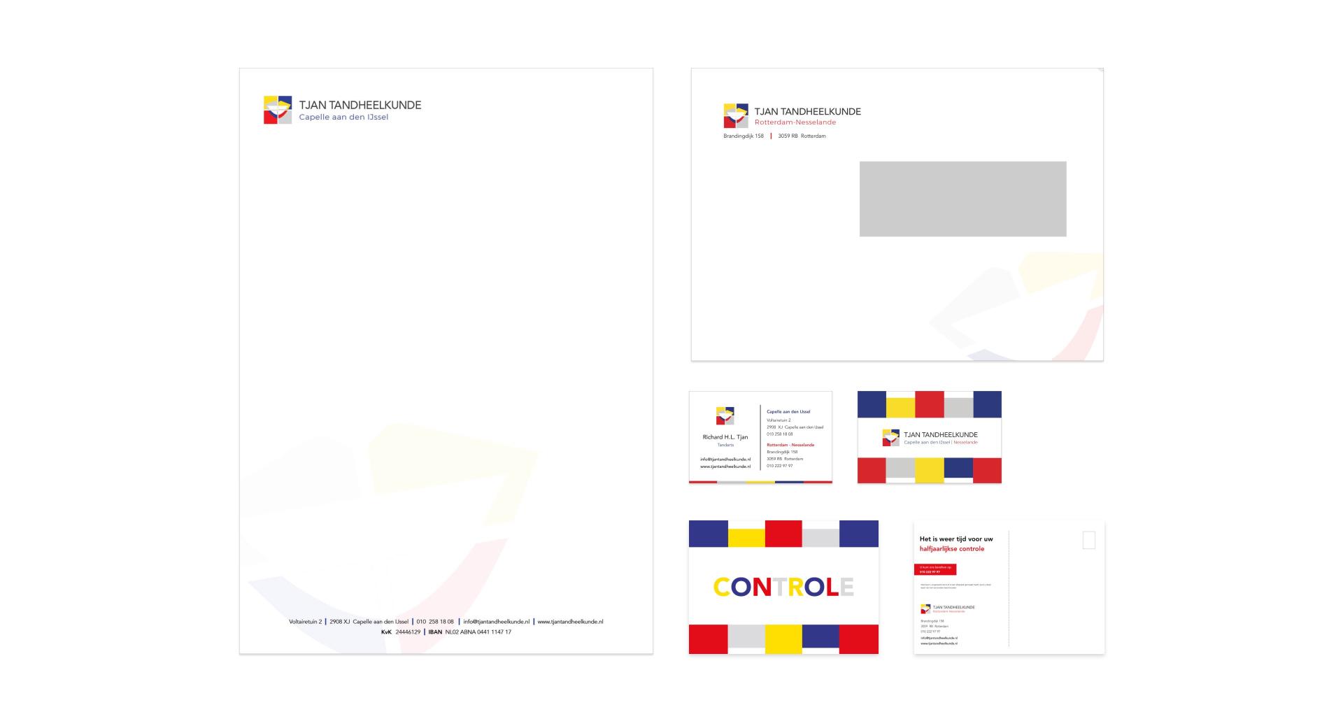
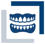
Logo and corporate identity
We have thoroughly examined the Tjan Tandheelkunde logo to give it a contemporary, cheerful twist. The mouth, so characteristic of the dental practice, is derived from the old logo. The style elements that are reminiscent of Mondriaan's artworks are completely new. This was a wish from Tjan Tandheelkunde for the new logo and the new corporate identity.
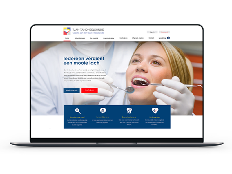
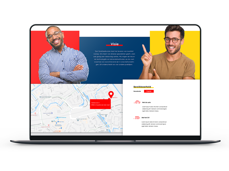
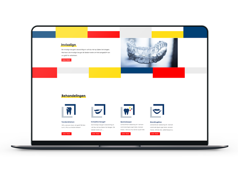
Website
A website is very important for a dental practice. It is crucial in providing patients with information about various treatments and rates. Also very important: being able to make an appointment via the website, that puts convenience first. The new website of Tjan Tandheelkunde, entirely in the new style, makes it all possible. The squares in Mondrian colors add that little bit of extra playfulness, which makes Tjan Tandheelkunde stand out from other dental practices.


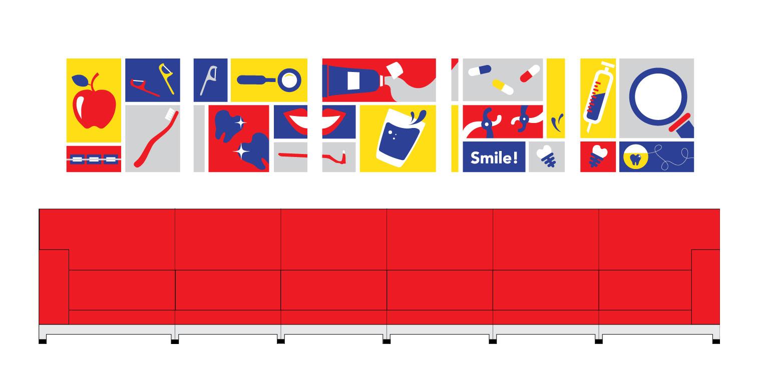
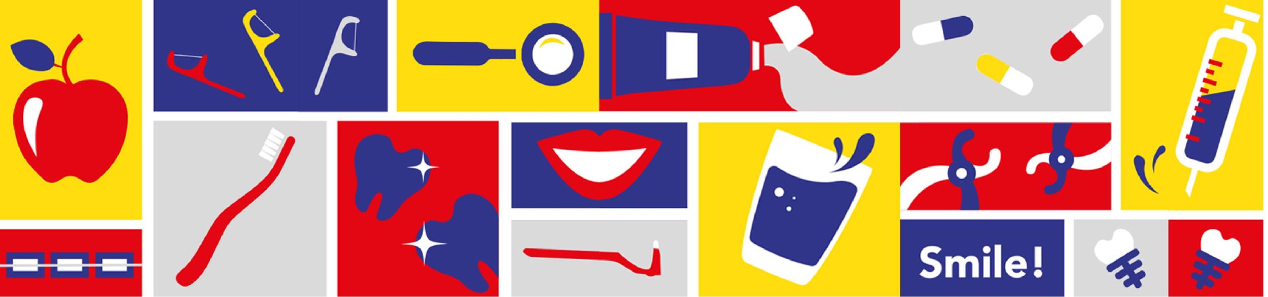
Lettering
Finally, we did the lettering of the practices in Nesselande and Cappelle aan den IJssel. Here you see the colored squares again, inspired by Mondriaan's work. Various elements that are characteristic of a dentist have been incorporated into the lettering. Say for yourself, doesn't it make you happy? For us, it certainly does!