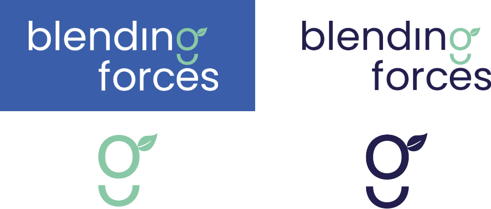
New logo for Blending Forces
Blending Forces creates programs to provide organisations and teams with motivated, healthy, sustainable and results-oriented solutions. Blending Forces supports companies with a fresh online, offline or hybrid kick start to organisational change.
We blended this together in the new logo. The choice for this logo is based on the 'less is more' principle: transparency, simple yet powerful. The logo really smiles at you and serves as a true source of positivity. In addition, the logo exudes health and sustainability. The leaf gives a small nod to the logo of the Smoothie Club, the sister company of Blending Forces.
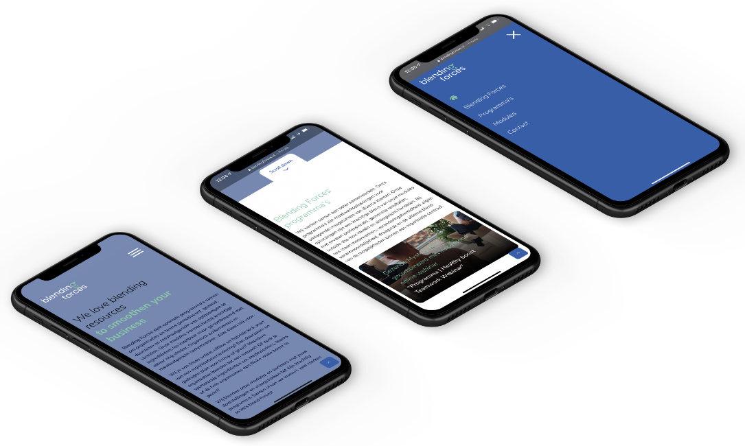
The new Blending Forces website is live!
At Blending Forces, modules and partners are blended together with their matching objectives and issues into one powerful program. We also wanted to reflect this in the choice of fonts. In the logo we have chosen to use the font Poppins Regular. This is an easy to read font, which is open and friendly. We have chosen to blend it with Avenir on the website and in the printed matter, which gives a nice contrast.
The new website is more mobile-friendly than ever!
- Our developers have worked hard to create a mobile-friendly website. To create the best possible User Experience (UX) colors were added to the design. The chosen colors are:
- Dark navy -> challenge and perseverance
- Blue -> social and reliable
- Mint -> refreshment and health
- White -> modernity and honesty
These colors create a modern look. The square blocks with rounded corners create a soft, positive and friendly website look.