TB Medical
TB medical is the medical sister of tattoo practice Tattoo Bob. Bob is one of the first tattoo artists in the Netherlands! TB medical uses their knowledge of the skin they have been collecting and innovating since 1968. This is why they even operate in hospitals where they and the team are asked to place mainly 3D areola pigmentations. For TB Medical, The Dare Company has realised several projects. Read about it below!
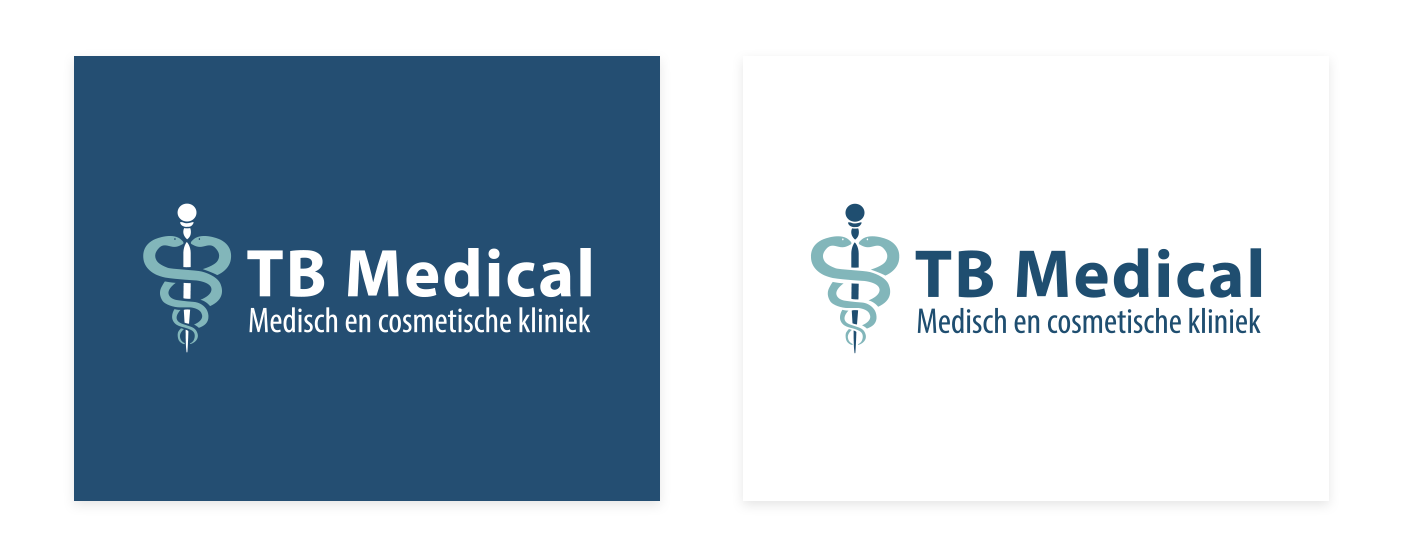
Logo's & Corporate style
The Dare Company has revamped its logo and corporate identity. TB Medical wanted a more clinical and clean look, so we chose the blue colour. They also wanted the logo to reflect the image of a caduceus, which is often used in the medical industry because of its association with healing. We also used many professional images of their treatments in the corporate identity, complemented by the blue and white colours.
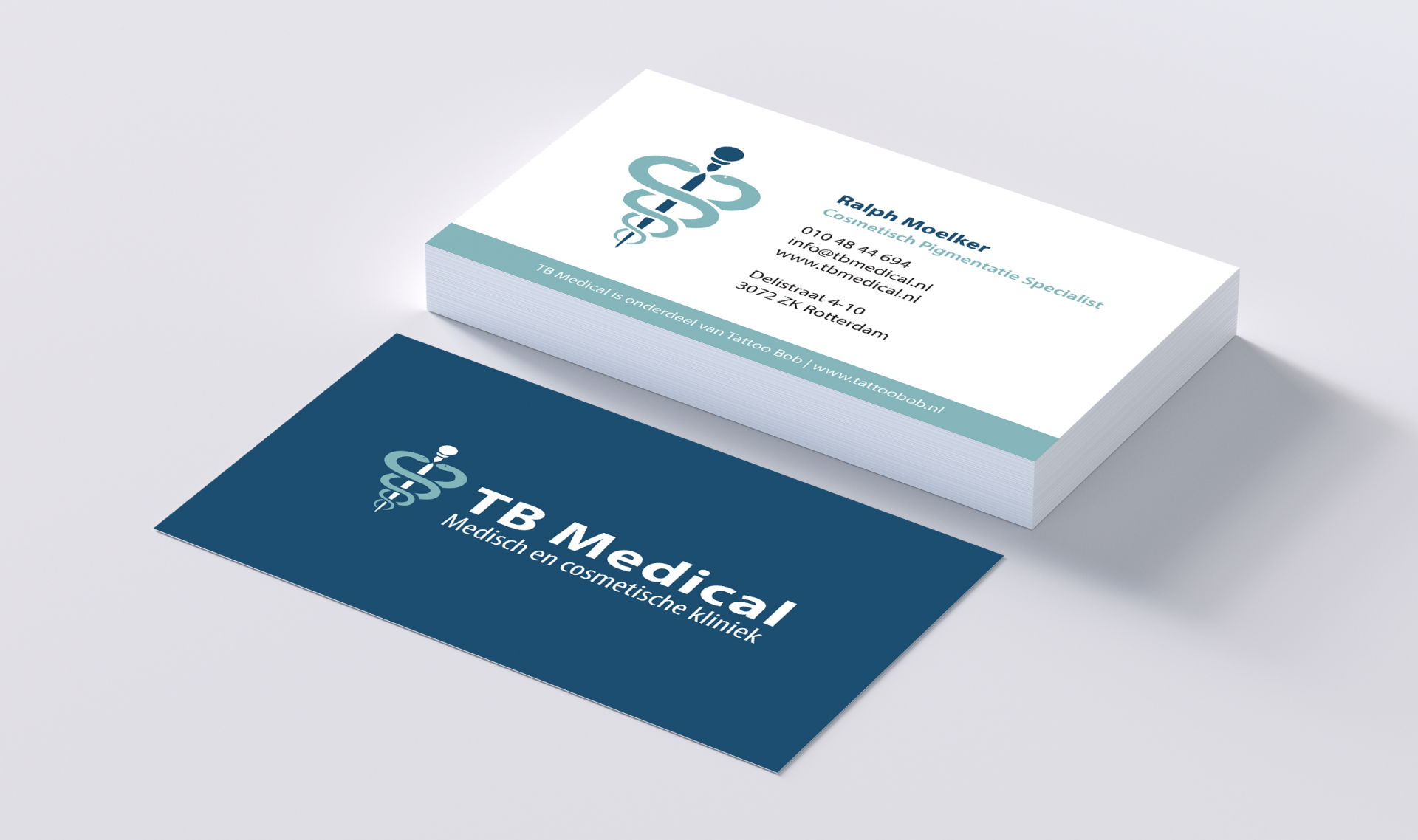
Business cards
The business cards are fully formatted in the corporate identity, with the logo clearly visible on the back. All the important information is clearly displayed, without losing the clean and professional look.
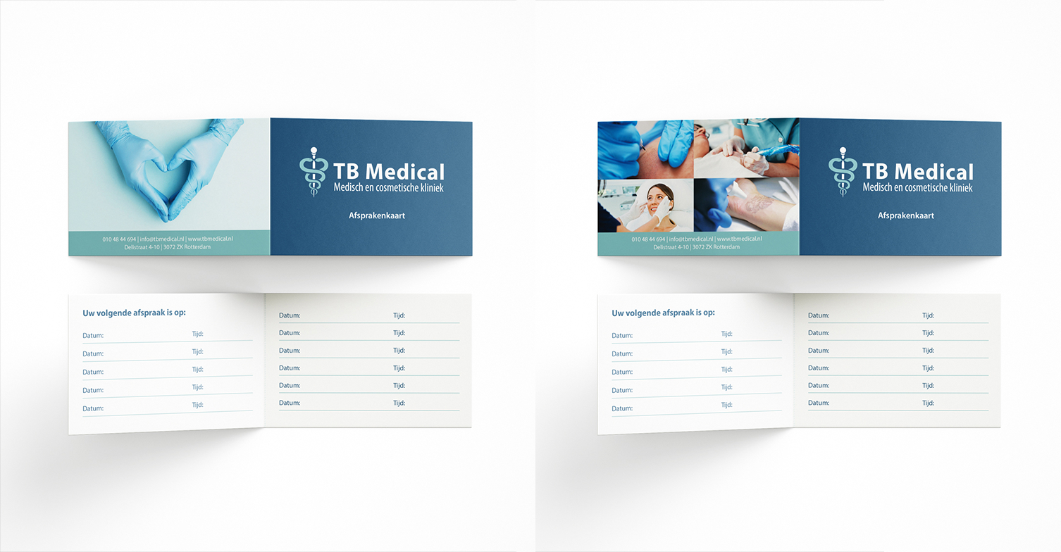
Appointment cards
The appointment cards were also made in the house style, like the business cards. They also feature photos of the treatments. For instance, there are four photos showing TB Medical's most popular treatments. The card clearly shows your treatment and date.

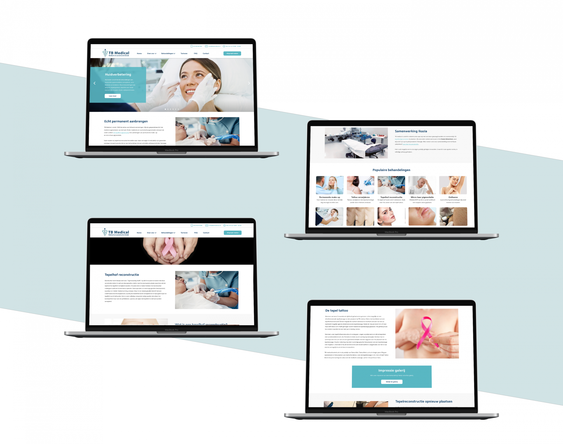
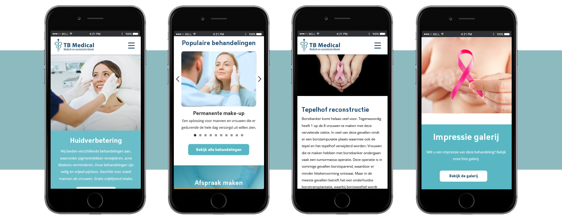
The website
TB Medical's website has been given a fresh new look with the new corporate identity! All treatments are clearly arranged in the menu and the popular treatments are highlighted on the homepage. TB Medical thinks it is important that clients are provided with all important information. Each treatment therefore has a page where everything can be found. There is also a built-in gallery where clients can see the 'before' and 'after' photos of treatments. The entire website is designed for clarity and usability!