TintelTuin & The Dare Company
TintelTuin is a unique network consisting of over 70 child-, day-, and schoolcare locations in the surroundings of Amsterdam, Zaanstreek, and Waterland. With over 30 years of experience, TintelTuin is a household name in the field of high-quality childcare. TintelTuin offers a safe place where children can find plenty of challenges and have every opportunity to grow. They have become an important and major player in their market. TintelTuin has approached us, The Dare Company, to adjust their corporate identity and give their website a complete makeover.
Corporate identity & brand logo
The first task was to analyse the corporate identity of TintelTuin. The wish was to adopt a more modern look, however respecting the company colours and the overall look and feel.
We have adjusted the shape of the brand logo in order to make it easier to read. Next, we have erased the shadow from the previous logo. This detail was destracting from the logo's functionality and in this case, the principle of 'less is more' is very applicable.
Next to minimalising and making the brand logo more readible, we have looked into the logo colour combination and have implemented restrictions in order to guarantee optimal visibility. See the adjustments that were made in the images below.
Lettering of vechicles
After designing the corporate identity, we started working on the analogue marketing expressions. One of the projects was the design of car lettering.
During the design process, we took into account the importance of a recognisable corporate identity. We aimed for an original, playful design that stands out. This resulted in the design where the children in the van seem to communicate with people outside through speech bubbles.
Vernieuwde Website
After finalising the corporate identity and implemting it in several touchpoints, our "Dare to Develop" department started designing and programming the website. During this process, it is important to focus on user-friendlyness and functionality without losing sight of the correct look and feel. Our UX designer started this project by thoroughly investigating the old website and analysing the user experience aspects where improvements where necessary.
Interaction & User Experience Design
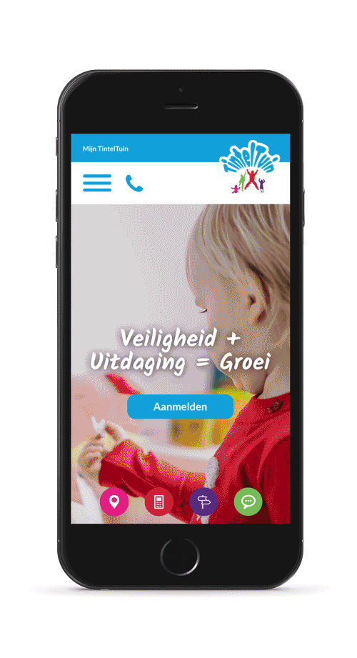
Next to redesigning the complete corporate identity, we were asked to renew the TintelTuin website. The style of the current website was outdated and the user experience and friendliness was lacking. A requirement for the redesign was to trigger the visitor to interact with the website. In other words, the aim was a more active experience, realised by incorporating valuable Call to Actions, which in turn increase conversions. We have defined the new website structure and flow, making it easier for the visitor to find the most relevant information he or she is looking for.

Call to Actions
In order to increase the interaction between visitor and website, we have looked into the most important goals of the website. This resulted into the following:
– Search and view locations
– Calculating daycare costs
– Requesting a visit
– Application
– Contact through phone or Whatsapp
For these CTA's, we designed and developed icons that are visible on each page. TintelTuin is able to determine which CTA's are most important on each specific page and these will be continuously visible on the right side of the screen. This triggers the visitor to directly act by contacting TintelTuin or by filling out the application form.

User Interface design
After determining the flow and sketching the wireframes, we started translating it to the visual design. We kept a strong focus on combining functionality and user-friendliness with aesthetic perfection. The website needed to become an extention of the TintelTuin brand. In order to achieve this, we have used the colours and fonts consistenly on each page.