Youth psychiatrist Lucertis
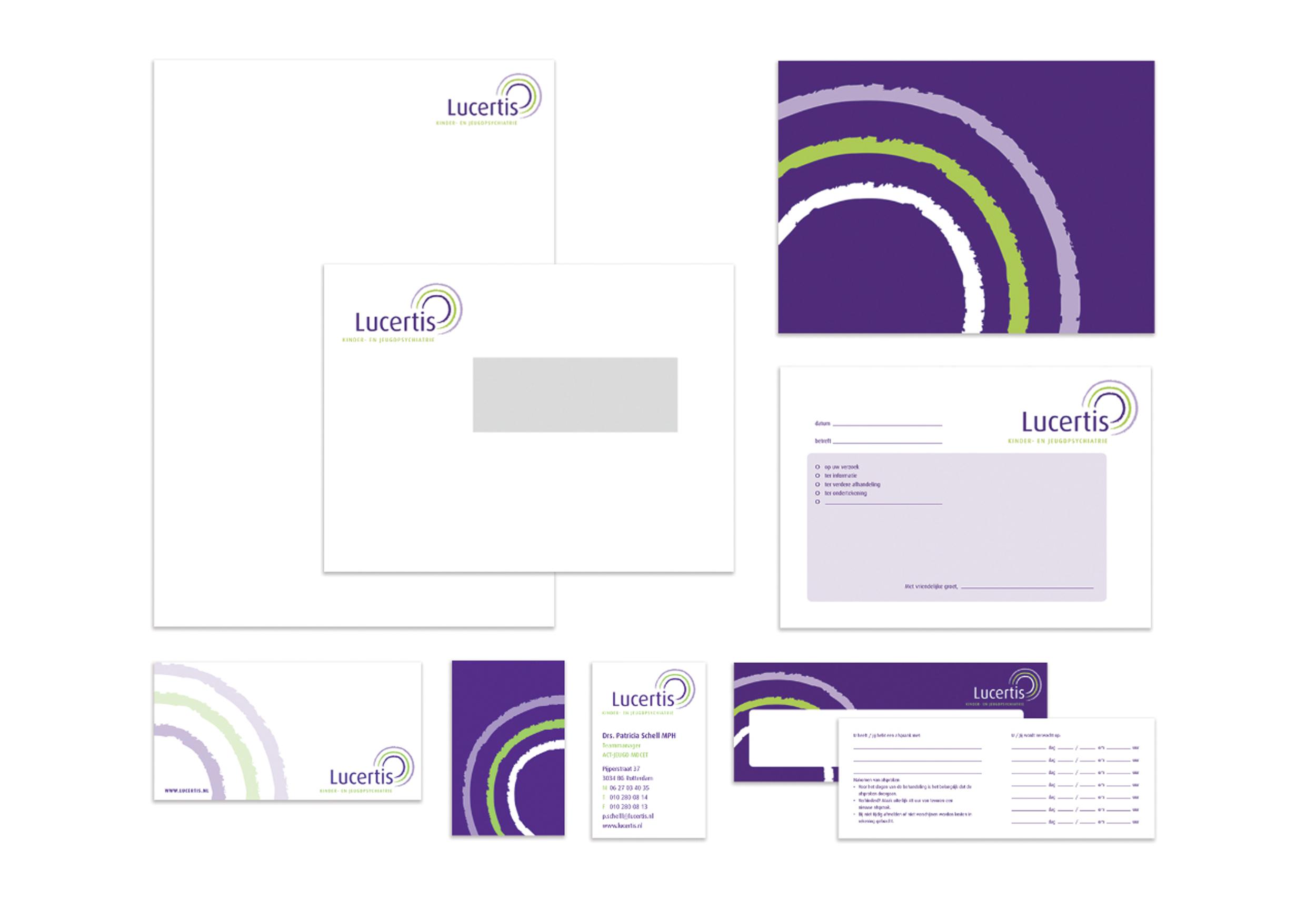
The Lucertis care institution specialises in child and adolescent psychiatry. Lucertis asked us for help with the development of the logo, website and corporate identity. The name Lucertis is composed of Luce (light) and Certis (certainty). We managed to incorporate these two elements in the Lucertis design.
Identity Lucertis
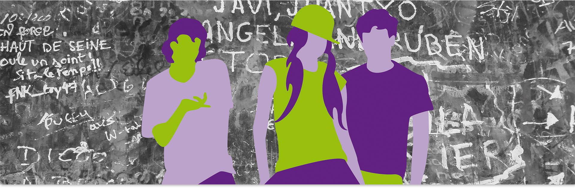
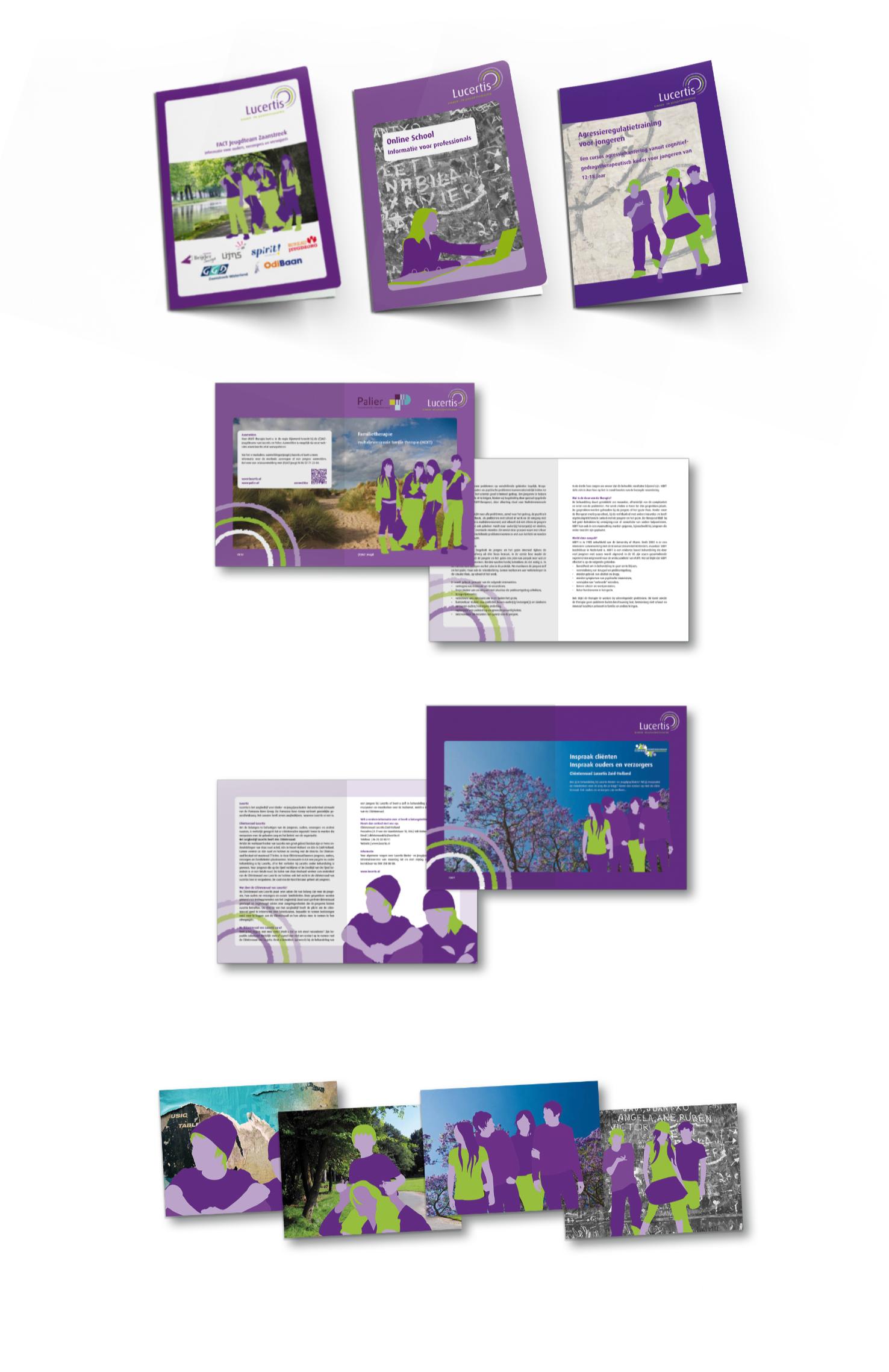
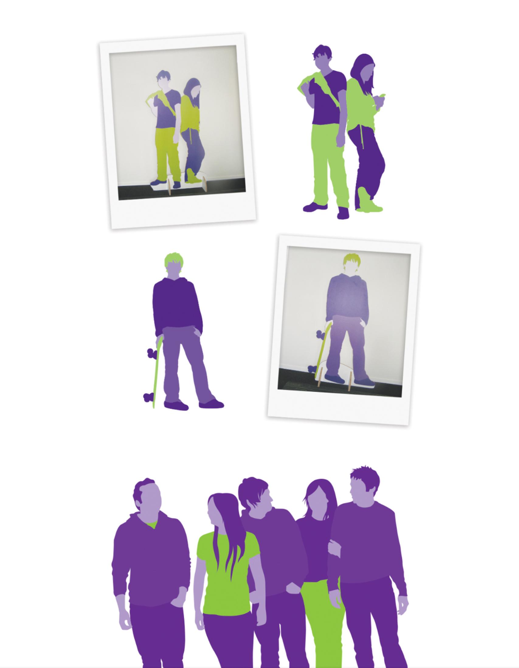
The corporate identity consists of two colours; the main colour is purple and a fresh, green colour functions as support. One of the unique elements in the corporate identity of Lucertis is the use of silhouettes. This gives it a unique and personal appearance that is of great importance for an organisation in this sector. The corporate identity is timeless and can be applied anywhere.
Website development
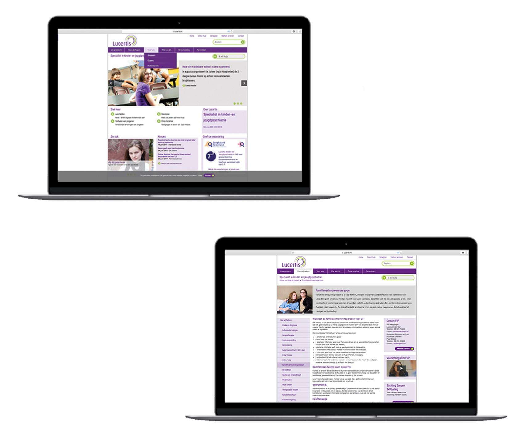
We have fully incorporated the corporate identity of Lucertis into the look of the website. We designed and developed the entire website for Lucertis. We have also taken the user experience into account by optimising the user-friendliness of the website. We have chosen to give the website a modern yet relaxing look.
Various Printing
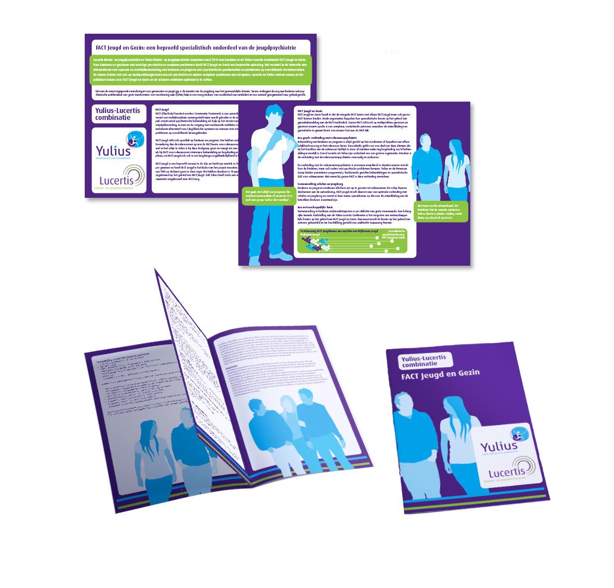
We have taken great pleasure in creating the logo and all printed matters that symbolise the wide range of treatments Lucertis offers. The combination of clinical, part-time or ambulatory care is reflected in the expressions and we have also included the interaction between client, environment and organisation in the design.
Silhouetten signs
The colour combination and the anonymous, yet personal, silhouettes give the corporate identity of Lucertis a familiar face, which increases the brand's recognisability.
Lucertis and Yulius
Lucertis and Yulius have joined forces since 2017 in order to be able to offer a better range of help for children. We were allowed to make varied printed matters in the colours of Lucertis and Yulius.