KC de Telescoop
KC De Telescoop is a new children's center in the municipality of Leidschendam-Voorburg, which in addition to a BSO and toddler care also includes a daycare center. We from The Dare Company were asked to develop the logo and corporate identity for this center. With this we then developed T-shirts, bags, caps, pledge lettering, business cards, stationery and a website!
Logo
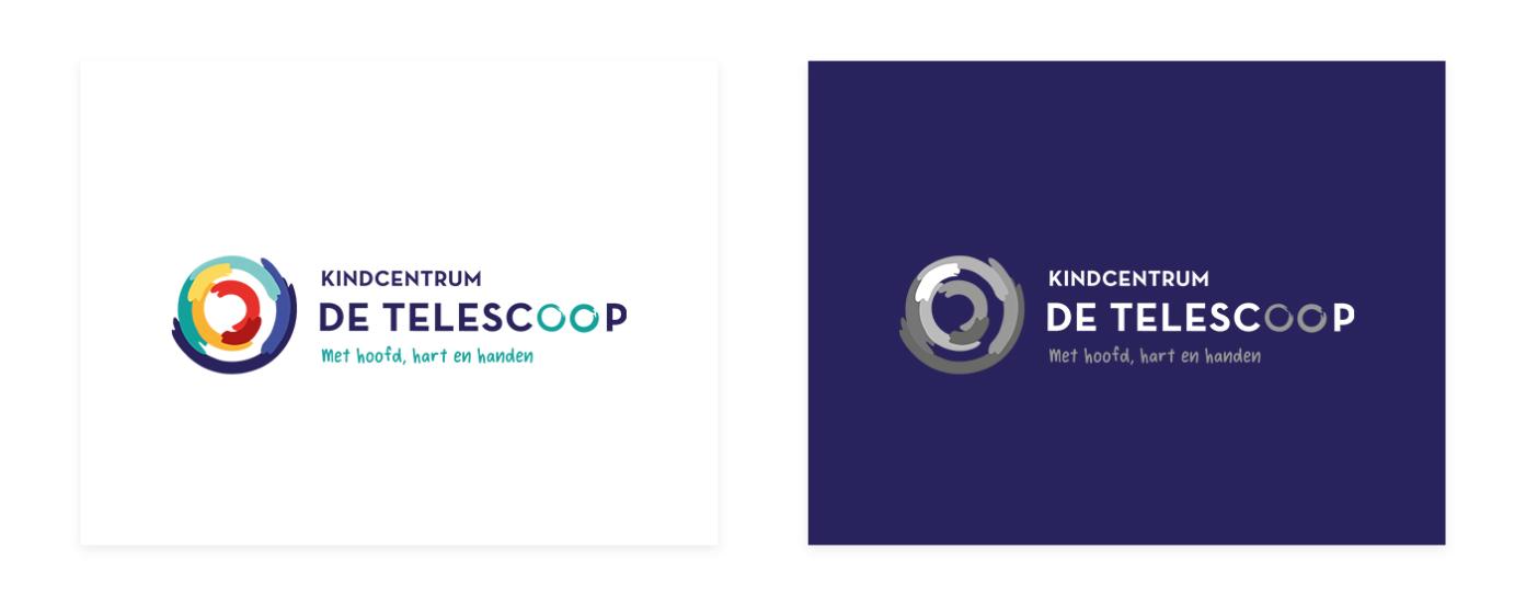
On the logo, under "Kindcentrum De Telescoop," you can see the motto "With head, heart and hands" in a playful font, reminiscent of handwriting. Next to this text is the logo, which consists of several half, or smaller, circles. These are placed so that the whole is a round shape, reminiscent of the lens of a telescope. Also, the letters "o" in the word "Telescope" are in a different colour and worked in such a way as to be reminiscent of a lens.
Corportate identity
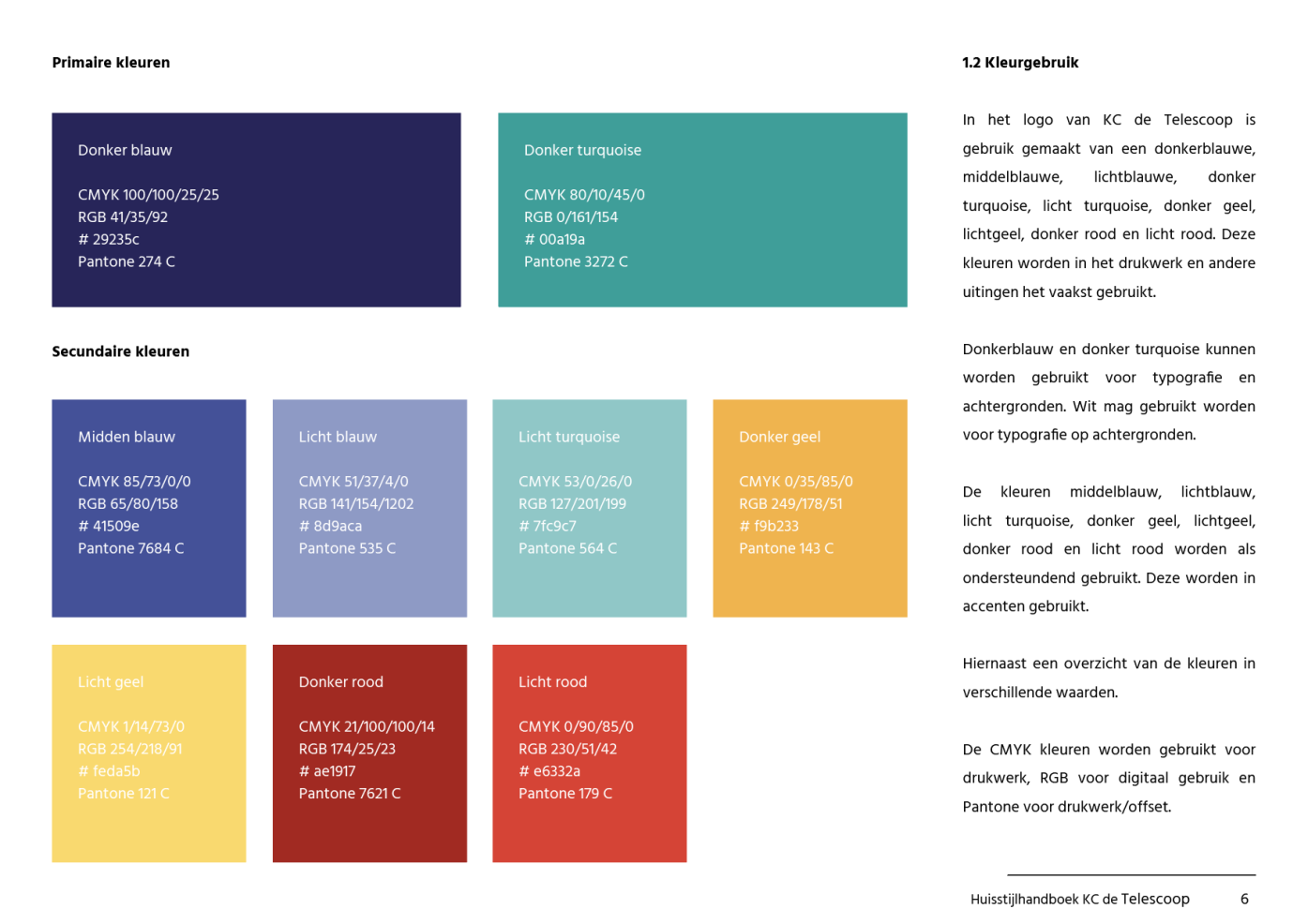
In the corporate identity, all the playful colours come back from the round shapes of the logo. Dark blue and dark turquoise, two colours that go very well together, are the main colours here. The shapes that make up the round shape in the logo are individually reflected everywhere, and are playfully spread across the various media expressions.
Shirts, caps en tote bags
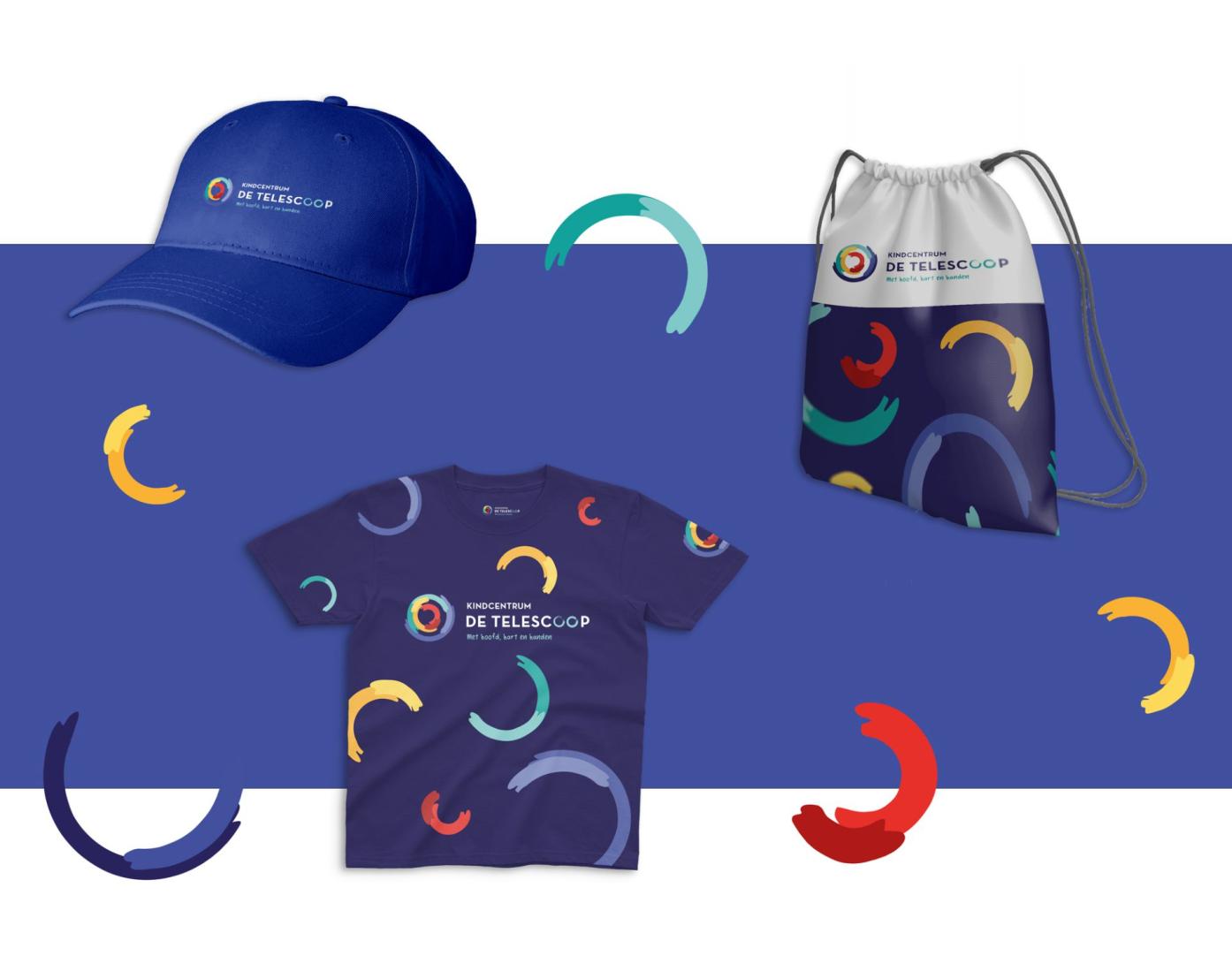
Besides designing caps that feature the round logo or the full logo, we used the logo and the round shapes of 'the telescope lens' to design cool shirts and tote bags. These will be great for the kids to wear!
Report en homework folder
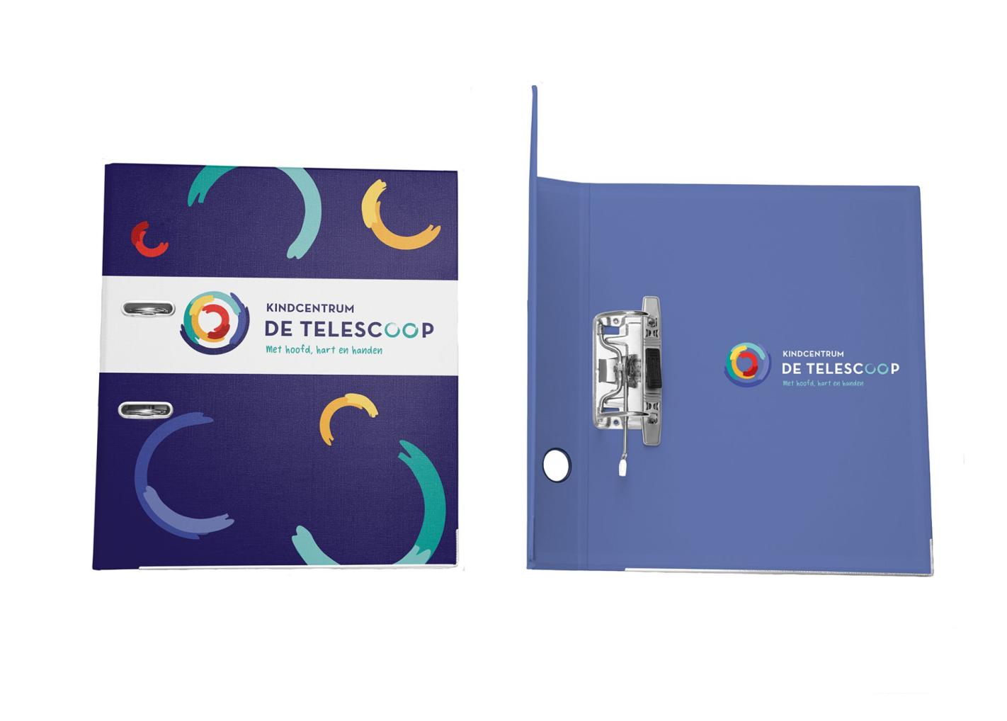
To give all children a sense of the children's centre they are in, it is nice to be able to give them all folders and reports in KC De Telescoop's corporate style. So we designed these; beautiful in the dark blue of the logo style and of course with the logo on it. The logo is also scattered throughout the design, just like the shirts and tote bags.
Correspondence printing
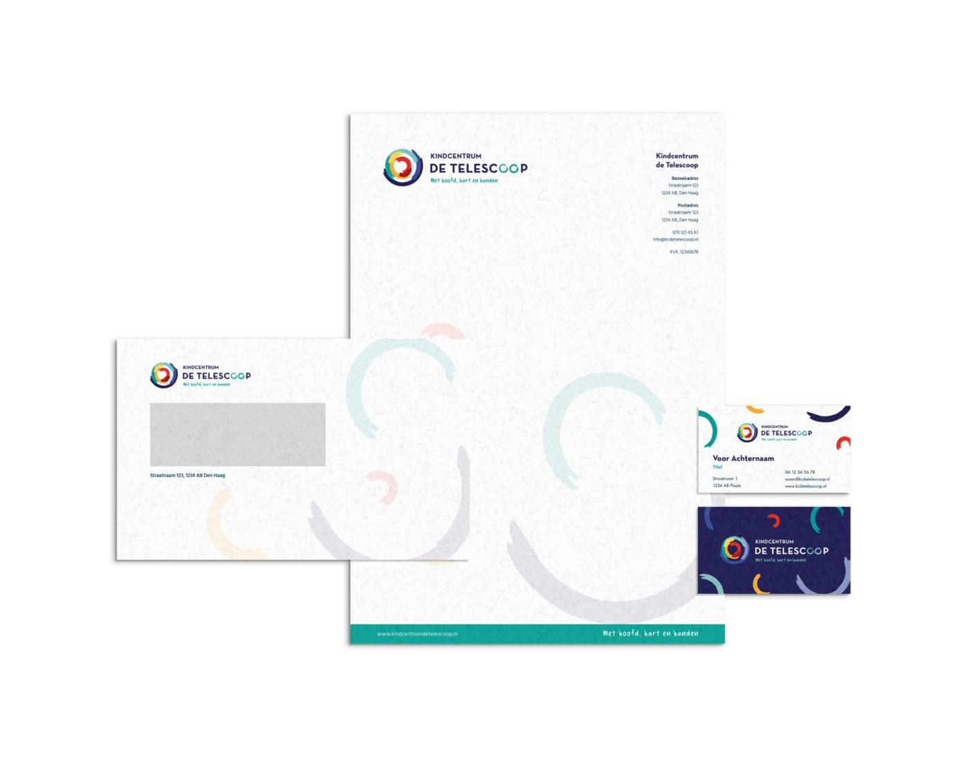
We also designed the printed matter for KC De Telescoop. We designed the envelopes, business cards and stationery. The logo is on everything, of course, and all the details are on the letterhead and business cards. The logo is again scattered throughout the designs, as separate semi-circles in the background.
Website
The primary and secondary colours of the corporate identity are all reflected in the website. The round shapes from the logo are there again, with parts of the logo also used to insert photos. This makes it look like you are looking at the photos through a telescopic lens!


