
Marketing
That sticks
More-Itz
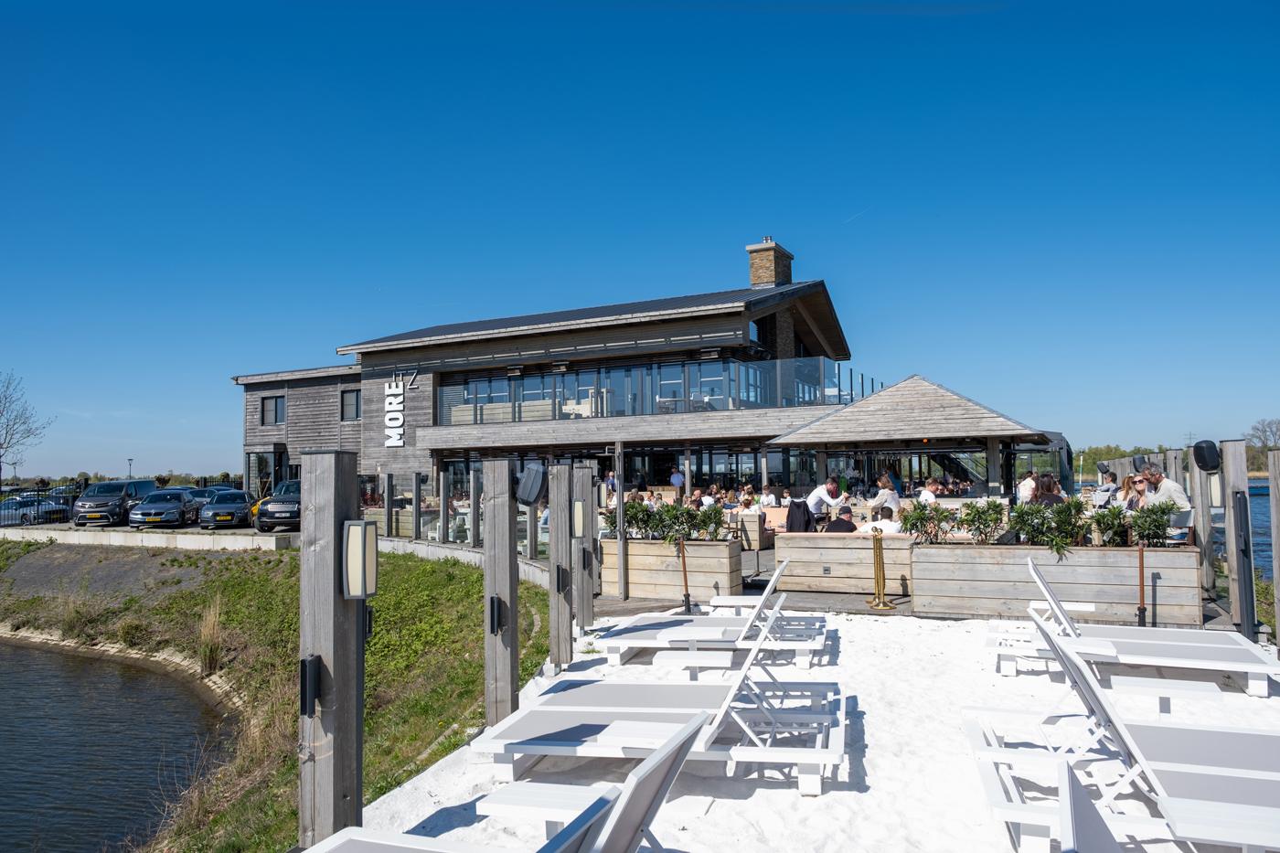
More-Itz is a place where the sky truly is the limit. Surrounded by nature, it offers the perfect setting for a casual evening out, a business meeting or an unforgettable wedding day. You have to visit to understand why people keep coming back
The Brief
More-Itz wanted a brand identity as distinctive as the location itself. They were looking for a strong brand that immediately conveys the atmosphere, the energy and the feeling of "more." The brief was clear: bring the MORE into the branding.
The challenge
The challenge was capturing a feeling. More-Itz is playful, energetic and full of surprises. That experience needed to be immediately visible in the brand, from the first glance to the finest detail. At the same time, the branding had to work across a wide range of occasions; a terrace visit, a business meeting or a wedding. And to truly deliver on the promise of more, it needed a seasonal variant that would reflect the winter atmosphere of the location just as powerfully.
Our approach
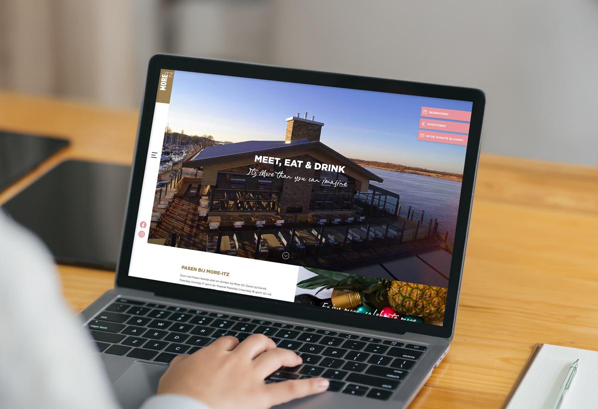
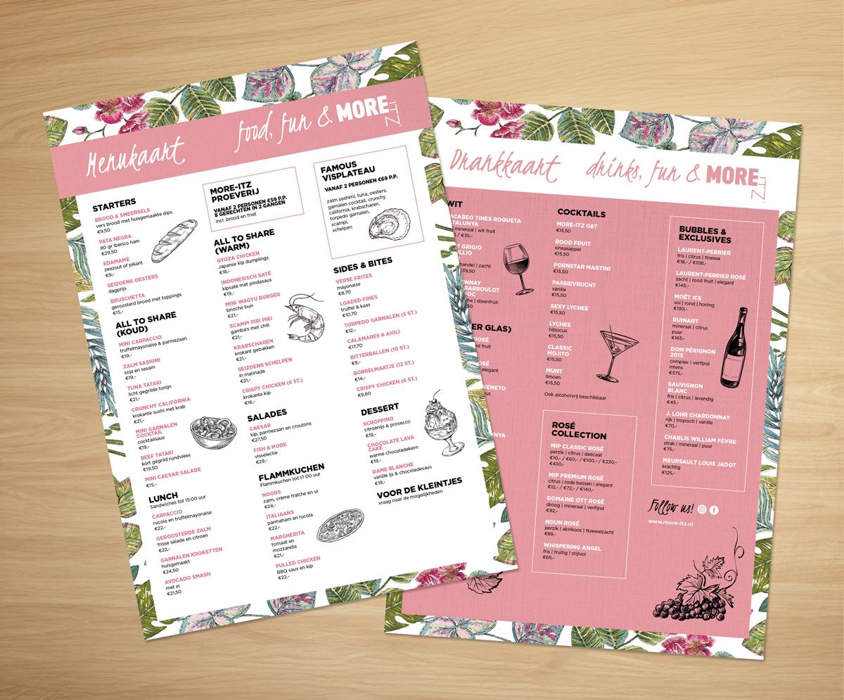
We opted for a playful, vibrant aesthetic that immediately reflects the energy of the location. Pink tones give the brand a bold, unmistakable character, while custom illustrations strengthen the experience and create recognition across every touchpoint. The typography pairs a playful script font for an informal, inviting feel with a strong bold typeface for headlines that truly stand out. To make good on the promise of "more," we also developed a special winter design: as the seasons change, the website transforms into a blue-toned theme that perfectly captures the winter atmosphere of the venue.
The Result
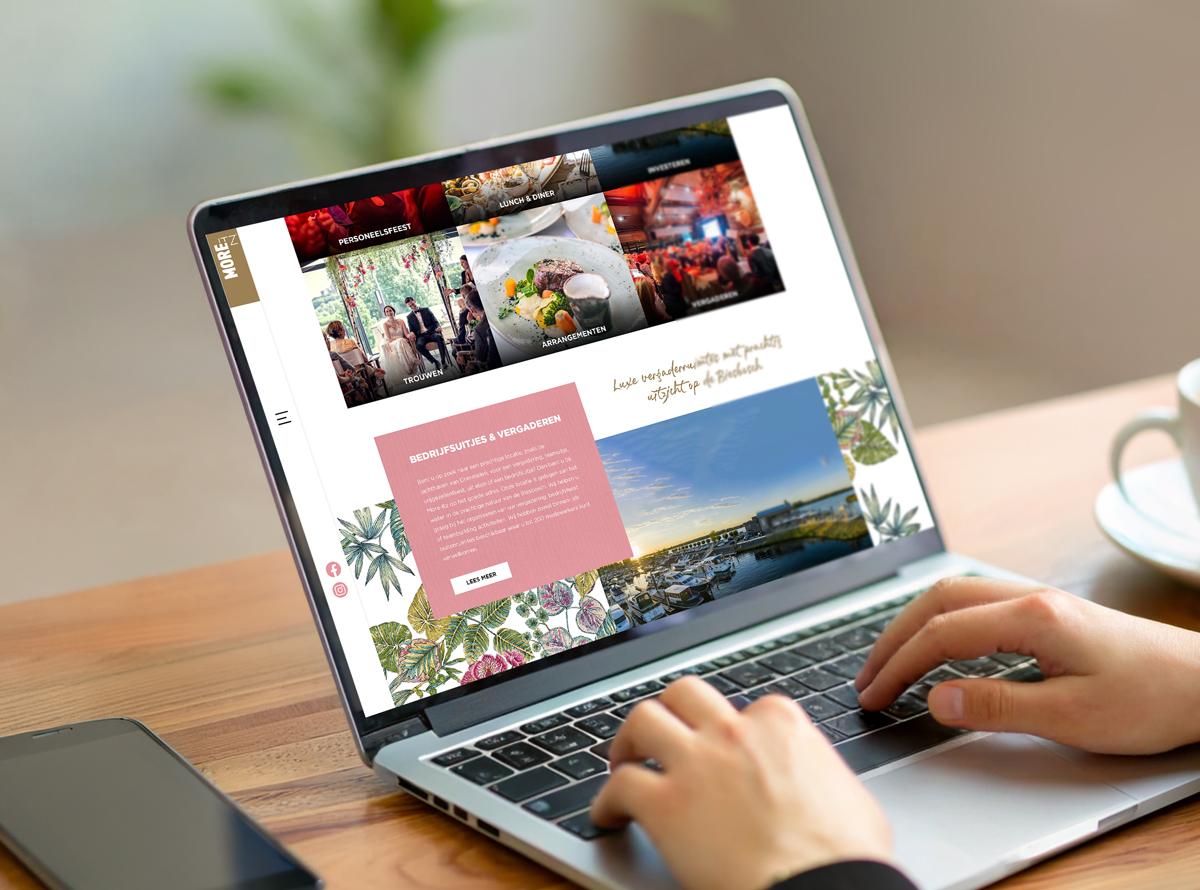
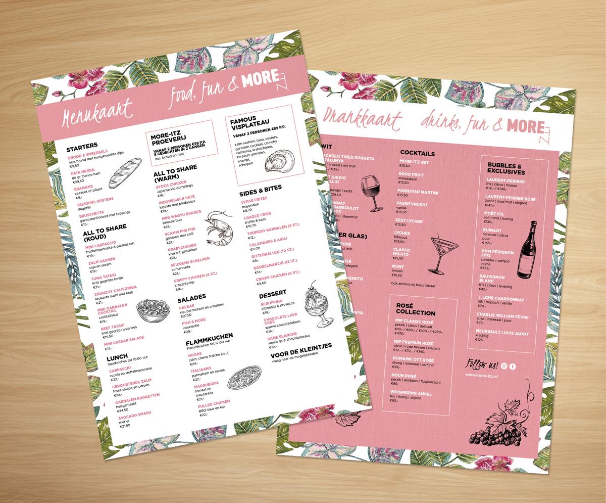
In Need of professional branding?
With 20 years of marketing experience and a fully in-house team, we help you present your organisation clearly and distinctively. Let's discover your opportunities.